Monday 30 September 2013

Manly 40th

We went to a 40th on Saturday but I couldn't share the card and gift until today when the actual birthday happened and I knew it had been opened.


I went for a very simple bloke gift - a decent bottle of port as I know it's a favourite after dinner tipple and before putting it in a bottle box I made a bottle tag  over it that I cut on the cameo.  I cut some large numbers and double embossed them to match the sentiment from Waltzingmouse's new putting on the ritz set on the bottom.

For the card I used Stampin Up's Morning Post Alphabet and embossed in silver in on grey card before inking it up again in black and stamping off to the left for a 3D look.  Mounted on a black base with a couple of rounded corners and hand drawn silver line - very masculine.  I added another of the sentiments from the ritz set on the inside as it really suits the recipient!


Sunday 29 September 2013

Party Animals

It's my day again over on the Make the Day Special blog and I thought I'd use the opportunity to squeeze in a very last minute entry into the current Avery Elle challenge which is to be inspired by the photo above.

I thought it would be fun to play with the little party animal set - I LOVE this set - it really appeals to my sense of humour, and I thought I could interpret the cable cars into a row of balloons hanging ready for a party.


I cut 6 balloons in the colours of the cables cars and fussy cut them out with a little white border.  I used peacock distress ink and pearl spritz to create a background and then used some black twine for my "cables" to hang the balloons from.  Each balloon was then mounted with pinflair gel for a little dimension before I stamped the sentiment in the corner to finish.


http://blog.averyelle.com/2013/09/an-invitiation-our-september-aeiu.html

Saturday 28 September 2013

Putting on the Ritz

I've been playing with my new Waltzingmouse stash this morning, which I shouldn't have been doing really as I've got cupcakes to bake, but when I saw the sketch at LIM this morning I couldn't wait to play  http://simplylessismoore.blogspot.co.uk/2013/09/week-139-sketch-10.html


I used the Black and White plus a splash theme from ColourQ to create this simple card just using stamps from the new Putting on Ritz set plus a feather from Fine Feathers.   I stamped the round frame and head in black and die cut the circle.  I used neon pink as my "splash" a cut a feather out by hand adding a tiny gem to the headband too.  The sentiment is also from the same set - I hope I'm forgiven for moving it more centrally - I TRIED to do it off centre but my need for symmetry won through in the end.


Whilst I'd got the stamps out I made another card - this time using the colours for our current challenge at Waltzingmouse Fanatics - we're really low on players this time - just 2 entrants so far - so I thought I'd show that you can use just 3 of the colours (for me the two browns and one of the reds) in case the 6 colours were too intimidating.


I used a background from Art Deco backgrounds and stamped it in chocolate pearl onto kraft.  I then made the square frame and my favourite sentiment from Putting on the Ritz the focus of the card on another kraft panel.  Quick and simple but quite dramatic.

Right - time to make cakes......

Wednesday 25 September 2013

Runway leaves


The current picture at Runway Inspired really spoke to me this week so I had a play along with the challenge
http://runwayinspired.blogspot.co.uk/2013/09/ric44-zuhair-murad.html  The bottom really reminded me of my friends wedding dress.  My card is above and this is what inspired me to make it:


I used a memory box die and cut it from blue shimmer card keeping the innie bits in some and popping them out of others for variety.  I used kraft as my base as it was the closest I had to the soft taupe colour of the dress and to imitate the skirt I used some vellum but I wanted to tone down the "white" it gave when overlayed on the kraft so I carefully coloured it with my putty coloured copic before spritzing a little gold shimmer - all on the underside of the vellum.  I finished with a sentiment band with the gorgeous sentiment from Waltzingmouse stamped and embossed in smokey slate embossing powder from stampin up.  I love the grey instead of silver - it adds a touch of elegance and makes a change from white too.


Monday 23 September 2013

Sending You Sunshine

You may have seen my little felt flower on my DT project for Make the Day Special yesterday - well it was actually the second felt flower I made this weekend - I was inspired by this week's theme at Less is More which is to use felt or material on your CAS card  http://simplylessismoore.blogspot.co.uk/2013/09/week-138-theme.html


I combined a few challenges with the felt theme - curtain call's photo full of sunflowers, http://curtaincallchallenge.blogspot.co.uk/2013/09/curtain-call-inspiration-challenge.html, the theme of flowers at Keep It Simple http://kis-challenge.blogspot.co.uk/2013/09/keep-it-simple-23-blumen-flowers.html and the beautifully simplistic sketch at CASe this sketch http://casethissketch.blogspot.co.uk/2013/09/case-this-sketch-46.html 


I only have one sunflower stamp and it's the Clearly Besotted one that everyone used at Curtain Call so I wanted to do something different with mine.  I stamped it in black onto some mustard felt and then cut it out - I flipped it over (it's a solid stamp and I didn't want to see the black) and then used some copics to add some shading to the petals.  I die cut a centre from brown felt (an xcut die I believe) and then stitched the two together with the addition of seed beads to give that heavy clustered feeling your get from a real sunflower centre with all their delicious tightly packed seeds.  I die cut 2 large leaves from the Love Quotes die set and back stitched some veins with embroidery thread.

I found a little scrap of brown striped DP in my snippets box and cut it to size and rounded the corners to match the sketch.  I stamped the sentiment from the same set as the sunflower - Blooming Marvellous from CB onto brown and embossed it with mustard ep cutting the end to form the banner in the sketch.  Then it was simply a case of sticking it all down - I've often struggled with glue and felt as it can soak in but I now find that pinflair gel is the perfect medium.


Sunday 22 September 2013

Fall leaves

Good Morning all it's my day on the Make The Day Special blog again today and this week I've gone all autumnal just in time for this last flash of summer we're all getting.  Hope the sun is shining on you today as it's glorious here in Sunny Sheffield!


I was inspired by the current challenge at CASual Friday's to feature shades of autumn and at least one leaf on your project - and as I have my new Avery Elle stash winking at me, it would frankly be rude not to play with the Modern Leaves set now wouldn't it.........    I also really liked the simplicity of the sketch this week at Retro Sketches so used that as the basis for my layout.


I wanted to make the big scribbled leaf the main feature on my card so I took a piece of white card smaller than my base and a selection of autumnal shades of ink and just went to town with random stamping.  If like me you find "random" a bit hard to do - follow the rule of 3 and stamp your leaf 3 times in each colour in 3 places and before you know you'll have covered your card ;-)

For my sentiment - also from the same set - I embossed it onto my base card with mustard EP from American Crafts and then added a shadow effect - this is super easy when you've embossed as you simply stamp again in a darker shade over the top but just to the left with a dye ink and then wipe it off the embossing.  Here's a close up.


My focal element is a flower die cut from brown felt (HA framelet) and 2 sets of leaves die cut from mustard felt with my Wplus9 Folk Art Florals dies again.   I hand stitched some tiny seed beads to the centre of the flower and added some streaks of orange stickles to stop the focal element being "flat" and finished with a few blobs of stickles around it to draw the eye in.

Saturday 21 September 2013

Fanatics Challenge No 2


So just to keep you all your toes - our challenge this fortnight at Waltzingmouse Fanatics is NOT a sketch but a colour challenge - based on the lovely image above ;-)

Now I made a card as soon as I set this challenge - and it worked out brilliantly - but then when I looked ahead of what dastardly really fun and interesting challenges we had coming up, I realised that it would be much more appropriate for another challenge so I had to rush and make another......


I decided to try to use all the colours and whilst the chillies themselves didn't speak to me (I'm a wimp with hot food!) I did stick to a foodie theme and pulled out the little bargain set Big Berries - Strawberry which I've only used a couple of times to date.  I simply inked two berries with two different shades of red ink (HA pale tomato shadow and SU real red) and the stems with two different shades of green (SU certainly celery and gumball green which I know is a bit off for the shade on the photo but we're not that strict at Waltzingmouse Fanatics so I think I'll get away with it lol!)

For the background I used the other two shades - loosely interpreted by me as a kraft base which I stamped with the super cute Pinstripe Mini Backgrounder using Brilliance Pearlescent Chocolate ink which is one of my all time favourite inks - I use it a lot as an alternative to black on masculine cards as the shimmer is subtle and not too girly ;-)  Then it was simple a case of finding an interesting arrangement of the fruits - hard with 2 - 3 would have been more eye pleasing but I didn't have room so I used my sentiment to form an interesting visual triangle and distract the eye from the oddly even fruit.....

Possibly not my best work but I found the colours rather, well, challenging actually - just who sets these challenges?  Oh yeah, that would be me lol ;-)    I hope you all find it much more inspirational than I did - we had such great cards in the gallery for our first challenge so I can't wait to see how creative you can all be.

We're just playing for fun this fortnight but we'd love to see if we can beat the 20 entrants we had last time so I do hope you'll join in :-)    Waltzingmouse Fanatics Challenge No 2

Friday 20 September 2013

Cool blues

There is a monochromatic challenge on the Lawn Fawn blog at the moment - I often find colour challenges difficult but monochromatic is more in my comfort zone so I gave this one a go  http://lawnscaping.blogspot.co.uk/2013/09/lawnscaping-challenge-66.html


I used the adorable Critters In the Snow set (currently out of stock at Make the Day Special but will hopefully be back soon for those of use on this side of the pond!)

I decided to use blue memento to stamp the igloo rather than the standard black to keep within the colour theme of blues that I'd opted for for my chilly scene and I'm glad I did as I really think it lends itself to keeping it feeling cold!  I coloured it with copics (in the 000 and 00 and 0 ranges mostly) and then added a few shadows with darker shades.  I went for a couple of seals - one using blue-grey copics and one using bluer shades - the latter is perhaps a little too blue to be realistic but I liked him!

For my scene I tore strips of DP to create the icy landscape and mounted them onto some sparkly dark blue card to give it a "all day night" feeling you get at the poles.  I embossed a sentiment from the set in white and then embossed 3 different snowflakes from the set using blue, teal and white glitter embossing powders (by WOW) before adding my igloo and seals into position and using toner grey copics to create some more shadows to ground them.

I like this sentiment as it could easily be a Christmas card or a winter birthday!

Thursday 19 September 2013

Hey There!

I finally managed to make a card for the current Clearly Besotted "stamp your own background" challenge  http://stampingsharing.blogspot.co.uk/2013/09/clearly-besotted-challenge-4-stamp-your.html


I used the little you said it set and 3 colours of ink to make a speech bubble background stamping them upside down and back to front and adding words into each.  My focal point comes from the other little call me set and for some reason I didn't get the matching dies (doh!) so I cut the phone by hand and coloured it with grey copics.


Sunday 15 September 2013

It's all about Geometry

I've been playing with rounded diamonds this weekend  for my DT projects for Make The Day Special - my first project is my entry for this week's CASology cue card of "silhouette" which I am just about in time to link up http://casology.blogspot.co.uk/2013/09/week-61-silhouette.html


I took a 9cm square panel of thick white card stock and selected a range of Hero Arts shadow inks and stamped each of the large flowers from the Folk Art Flowers set in a different shade randomly all over the card.  I masked the larger two flowers with sticky note tape and then stamped the leaves coming out from them to fill up the spaces in between.  You then get your own custom stamped floral background paper.  To take it one step further, I cut it into 4 equal squares and rounded two corners on each panel to give the geometric shape I wanted to play with and arranged them on my base card with a little gap in between.  I decided to add a silhouette focal point design using the companion dies using the bird house, birds and branches and finished with one of the lovely sentiments from the same set.

Once I'd finished the postman arrived with my new Avery Elle goodies which are in store now so naturally I had to get them inked up immediately and I was drawn to the Rounded Diamonds set with the same shapes I'd been playing with on my first card.


I wanted to play with the geometry to create some strong clean and graphical shapes as I thought this would give me a useful masculine card so I opted for blue, green and purple this time and again stamped each shape in one colour but this time directly onto my base card in a diagonal.  I added a sentiment from the sublime new Handwritten Notes set - I just love the little "extras" you can add to your messages.  To add a finishing touch I went with 3 little clusters of sequins in the same colours as the stamping.

I think the weather for most of the country is definitely the kind to keep us indoors and crafting today but we're actually off to Manchester to see our favourite comedian Daniel Kitson in a play about a tree!  (It’s early evening. it’s mid autumn. It’s starting to get dark. And on a quiet residential street somewhere in England, a man with a picnic basket, arrives at a tree. A new show about dissent, commitment, two people and a tree)  We must be mad to cross the Pennines given today's weather forecast but we follow him everywhere like stalkers ;-)


Saturday 14 September 2013

Mega-masking!

It's one-layer week at Less is More and this week they want a one layer get well card http://simplylessismoore.blogspot.co.uk/2013/09/week-137-olc-get-well-soon.html    I had an idea first thing this morning but messed it up with my choice of ink colours so only had time to make a second version this evening.  Get Well is also the challenge at Addicted to CAS this week so one card, two challenges ;-)


When you one to add some depth to a one-layer card then masking is your friend - I decided to go masking mad today and made 4 masks of the cute little bug from Papersmooches Healthy Vibes set so I could keep over-stamping until I'd filled my masked off frame on this 4x4 card.

When I did the first version I finished with the purple ink and stamped one just off centre to fill a gap but the purple was too dark when I embossed the sentiment into the middle it was totally lost.  In this version I kept the purple to the edges and just used the paler blues, yellows and greens in the centre and this time the sentiment is still clear and legible.   Once I removed the masks I just hand drew a black framed line to hold all the little bugs in and stamped the companion "feel better soon" sentiment on the inside to finish.

Now I've joined the Make The Day Special DT I would have linked up the stamp set to the store as you can get Papersmooches and lots of other hard to get US stamp company's goodies (Mama Elephant, Avery Elle, WPlus9 etc) but unfortunately this set is currently out of stock.  I will be back tomorrow though (Sunday is my day on their blog) with a couple of cards with sets that are in stock - including the gorgeous new release from Avery Elle ;-)


Thursday 12 September 2013

Autumnal FUSE

The challenge this week at Less is More is to use the colours Dark Green and Rust http://simplylessismoore.blogspot.co.uk/2013/09/week-136-colour-challenge.html and that naturally lead me down the autumnal path particuarly given the recent change in the weather and also because I wanted to play with my new Fiskars FUSE creativity system - more on that later - first here's my card:


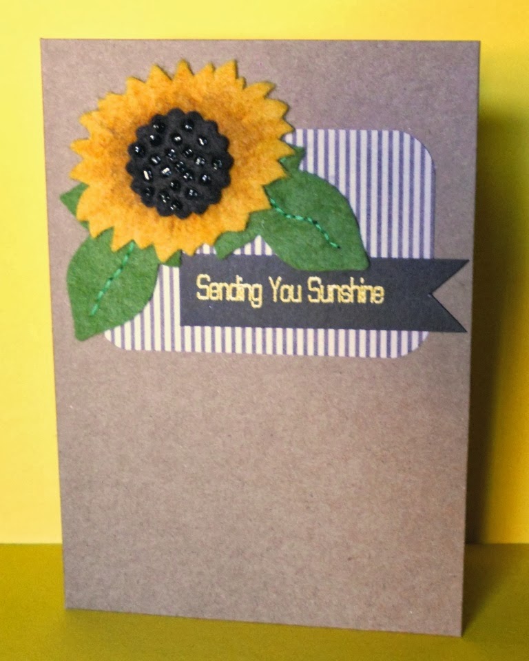
I created the focal point using one of the letterpress and die sets on the FUSE - I created my own custom card by blending 3 distress inks onto some kraft card (rusty hinge, spiced marmalade and mahogany) and spritzing with water with a little gold pearl powder in it.  I added a few splatters of red cosmic shimmer with a waterbrush and flicking technique.   Once dry I inked up one of the leaf designs from the FUSE die with potters clay ink - inserted it into the die and ran it through the machine to get the stamped, letterpress and die cut in one pass :-D   I mounted it onto a woodgrain inked panel using dark green ink (Waltzingmouse Woodgrain) edged with some dark green card stock.  I added a button and green twine for interest and finished with a sentiment from Clearly Besotted (Many Messages)

Now a little bit more on the FUSE as those of you who knew I had one had asked me what I thought of it.  Now I have to say that I was VERY, VERY LUCKY to win my machine - I entered a competition on the Fiskars European website, one of those 'just supply and email' that you often think no-one ever wins - well I can tell you know they do cos I did!!!   And very grateful I was too as the machines are in the "considered purchase" category for most of us but one was definitely on my wish list!

So - what do I think?

First off - it's a BIG machine - if space is an issue in your crafting space then you need to have a look at one before you consider a purchase - I have some photos below and it's sitting on top of a chest freezer and it fills the top of it!   For me though the size was a plus point as I was hoping I could use this machine instead of my grand calibur which I don't really get on well with (particuarly using the rubber embossing mats as I find they "stick" and squish too much)  I like the more "open" design of the FUSE which is more like my beloved Big Kick (same as a big shot but older!)

Now I haven't played with it tonnes yet - so this is my no means an expert review - I need to play around with it alot more before I can claim to understand it well but I thought it was worth sharing my initials likes and dislikes with what I have tried so far.

Firstly the pros - it's best feature so far has to be the ease at which you can create inked and uninked letterpress designs - the system is super-simple and gives brilliant results in seconds (as on my card above).  The starter pack comes with one die and two matching letterpress plates (as shown in this photo below)  You simply sandwich the die (similar to a sizzix bigz die in style but unfortunately they don't fit any other machine but the FUSE) with your desired plate inside with your cardstock and the little backing plate and feed it through and hey-presto perfect letterpress every time!  You can use the letterpress designs without the dies too although I haven't tried that yet so don't know what effect it gives.


The designs work well both uninked or inked and the plastic plates are easy to ink (nice and deep so you don't get ink where you don't want it) and very easy to clean (I just ran mine under the tap)   There are quite a lot of designs to buy now - the only UK stockist I've found is Hobbycraft where a die with two plates comes in around £20-£23 and an expansion pack of further plates to fit that die (typically 4 plates) comes in around £12.   For me personally the dies and designs are a bit limited - there were few that I thought I would get a lot of use out of (I picked the leaf to make an autumnal wreath)  May of the designs are too large to be used in the kind of card making I do - they are more for people who just want the die and letterpress to be the final card really (well in my opinion anyhow) as there are a lot of tags and basic shapes like squares and ovals etc.  It's all new though so maybe they will bring out smaller designs in the future (ie a die with 4 or 5 smaller leaves would be much more versatile)

Now the cons - the most disappointing thing I found is with the adapter plate system that you can buy (for a whopping £50!) which allows you to use your existing dies and folders from other systems.  My major con here (and I use the con in both its meanings) is that the plates are really the same width as the ones you get in a big shot - see the photo below - despite having all that lovely width - you can't actually cut on it as the plate only takes up a little more than half the width of the machine :(   Now, they may well bring out wider plates in the future - for more money - but I really think it is a bit of a con - why make the machine so wide if you can't use the width?  The specific dies are very narrow so don't need the width so I was really hoping the plates would be wider so I could put 12x12 cardstock through it.


The adapter kit comes with various shims and cutting and embossing plates so you can use all your existing dies and folders - and includes a table showing you what to use with which die etc - although this doesn't cover every die on the market so for the one I tried it with (a tattered lace die) I just had to guess (I used the spellbinders instructions) but I found I had to run it through a couple of times to get a full cut.  I also think the adaption system is quite complicated.

On the plus side again though I did get excellent results with a stampin up embossing folder and the extra width of the machine does allow you more flexibility of how you feed the card into your folder which if you're a one-layer card maker does extend the design possibilities of your cards (and is one of the main reasons I wanted a "bigger" machine" as I get so frustrated trying to get the folders through the big kick and not getting them in the orientation I want)   However, you are still a bit limited as some folders are wider than the adapter plate if you turn them landscape so your design doesn't fully emboss the width of the card.

These are as I said, just my initial thoughts on it and I may well find I'm "doing things wrong" as I get to grips with it - so watch this space.   At the moment though I'm really not as excited by the FUSE as I thought I would be (sorry Fiskars - don't mean to sound ungrateful but I'm from Yorkshire and we're known for brutal honesty) and I don't think it can replace my calibur :( even though I don't like the calibur much I don't believe the FUSE can do some of the "wider" things I wanted it for.  So it looks like a Big Shot Pro is back on my wish list..........

Monday 9 September 2013

Wish Big


As you know by now, our challenge for this month at House of Cards is this lovely colour combo http://houseofcardschallenge.blogspot.co.uk and this week it's the turn of the CAS team to show you what we can do with it.

This is my clean and simple take on it:


I must admit I found the colour combo a bit challenging to begin with as pinks and purples are not my normal go to colours but once I got my new Stampin Up sentiments the wish BIG sentiment gave me the inspiration to use my BIG candles from Hero Arts.   I stamped the candle 3 times using the two pale purples and the pink and fussy cut them out.  I added some partial embossing with some stars allowing them to fade into the middle.  I stuck the candles on top and then stamped the sentiment over the top of those in dark purple.  Finished with a little stickles and a star gem in the sentiment.

Can't wait to see what you all do with it now but remember to keep it CAS this week.


Sunday 8 September 2013

Joining a New Gang

I told you it was going to be a weekend of new and exciting things on this little ole blog of mine and today is the second new thing - I am thrilled to be joining a new gang - the wonderful and talented group that is the Make the Day Special Design Team :-)   From now on I will their new Sunday Girl.

Today I'm giving you a little look at some of the great sets from Mama Elephant which are available to pre-order now.  Make the Day Special is the only UK stockist of Mama Elephant so if you want their sets without the customs costs then you know where to go!  You need to be quick though as pre-orders close tomorrow.


For this little cutie I used 3 sets - Cosmic Stars, the companion set Starry Nights and Good Times.  Now if you're not into Astrology, you might initially think that the Cosmic Stars set isn't for you, but the images are sooo cute and don't necessarily need to have an astrological bent.  By teaming it with the sentiment from Good Times the Gemini twins just become a pair of besties ;-)   I used the little banner from Starry Nights to create a subtle background behind the twins which I coloured with copics and mounted onto a circle of teal card to make it stand out.  Very quick and simple little card but perfect to give to a friend.

So pop on over to the store now and get your order in before its too late.......


Saturday 7 September 2013

Waltzingmouse Fanatics is GO!

So it's our inaugural challenge at Waltzingmouse Fanatics today http://waltzingmousefanaticschallenge.blogspot.co.uk/ and we have a lovely sketch to kick it all off with.
 
I decided to make a couple of projects - one masculine and one feminine.  For my first project there was only one way to go - Way Out West with a focal element is from Sheriff and all done in kraft to keep it masculine.


I cut a piece of kraft card with a curved line following the sketch and then stuck it to my stamp mat and stamped two of the backgrounds from Way Out West across it - the words in crumb cake (SU ink) and the stars in black.  I adhered that to a kraft base card and kept the top part plain except for a silver stitch line.  I used another piece of kraft card to stamp the sheriff's badge and embossed with pewter ink.  Once cool I added a swipe of picket fence distress ink and buffed it off with a damp paper towel.  I'm quite pleased with this one.


For my second card I went more feminine and used the new Funky Flowers set as my focal element and a couple of sentiments from Say It Loud to create my background panels.
 

I'm not as happy with this one - I was trying to be clever with my background stamping and this version is my third (and best) attempt.  I cut a panel as before but this time in white and stamped the word "birthday" from Say it Loud across it in black ink.  I stamped "happy" from the same set in grey ink on my white base card but despite my best effort they didn't line up quite as I wanted (and yet I drew pencil lines and no I can't do maths!)  So I added a nice thick black line with a copic marker to cover up the mistakes and make a more defined dividing line.

For the focal element this time I stamped the largest flower from funky flowers in tangelo ink and then stamped the smaller one in pool and layered them up.  To form the flower centre I stamped the medium flower in tangelo again on shrink plastic to add a little dimension and interest.  I finished with a couple of leaves in pear tart which is my favourite green ink ever.

So now it's over to you - visit the challenge blog and play along for your chance to win a £20 voucher for Waltzingmouse stamps - you have almost 2 weeks to play so plenty of time to get your mojo rocking http://waltzingmousefanaticschallenge.blogspot.co.uk/


Thursday 5 September 2013

Waltzingmouse PJ Party Part 2


I didn't get time to play along with the bedtime story sketch on Friday night and we've been out and about a lot on our week off, but as we've been waiting in today for a delivery I've had a little time to play so here's my take on the sketch.  http://waltzingmouse.blogspot.co.uk/2013/08/pajama-party.html


I used the cut files on my cameo to cut out the sprigs and flowers in white card before using the Two Step Sprig and Flowers sets with shades of orange, yellow and green inks.  I die cut an oval of white card and inked up a sentiment from Compact Sentiments in black before mounting onto some papermania DP with a strip of teal card from my snippets box.  Once I'd layered up the leaves and flowers to follow the sketch, I added a little frame and butterfly made using the modge podge melts that Claire is stocking.  The frame should have more detail but I tried to emboss it (as shown in the product you tube video) but man do you need to be careful or it all just melts!  I liked the effect though so went with it.  For the butterfly I played it safe and coloured it with nail varnish for a quick but shiny effect.  I finished with a few orange gems for added sparkle.

Hope you like it.


Monday 2 September 2013

Krafty words

I've not played the CASual Friday's challenge for a while - I kept missing it or not having a good idea - but this week's challenge was right up my street - use kraft and a sentiment  http://cas-ualfridays.blogspot.co.uk/2013/08/cfc113.html   I love kraft card and I had a perfect stamp that was yet to see ink so here's my entry:


This fabulous big text stamp is from woodware and I decided to take a really simple approach to it this time (although I can see brilliant paper piecing possibilities for it later!) and simply stamped it onto a kraft base card and coloured it with faber castel pencils.  I added one of the additional sentiments that comes in the set to the corner and used that to create a frame with a black fine liner.


Blogging tips