Saturday, 15 October 2011

More Cocktails

I'm loving this mornings challenge at Less is More - I do love a cocktail ;-)  This time I thought I'd take a more obtuse angle rather just featuring a cocktail glass - so here I am with my interpretation of two cards based on two different cocktails - see if you can work them out....


My first card I think would make an ideal little thank you to the handyman in your life when he's putting up your selves in the craft room - mine has a job to do tomorrow so will get this when he's finished!  It's a tiny 3" square and the stamp is a personal impressions from a tool set.  The cocktail inspiration comes from the name - a screwdriver is basically the fancy name for vodka and orange.......


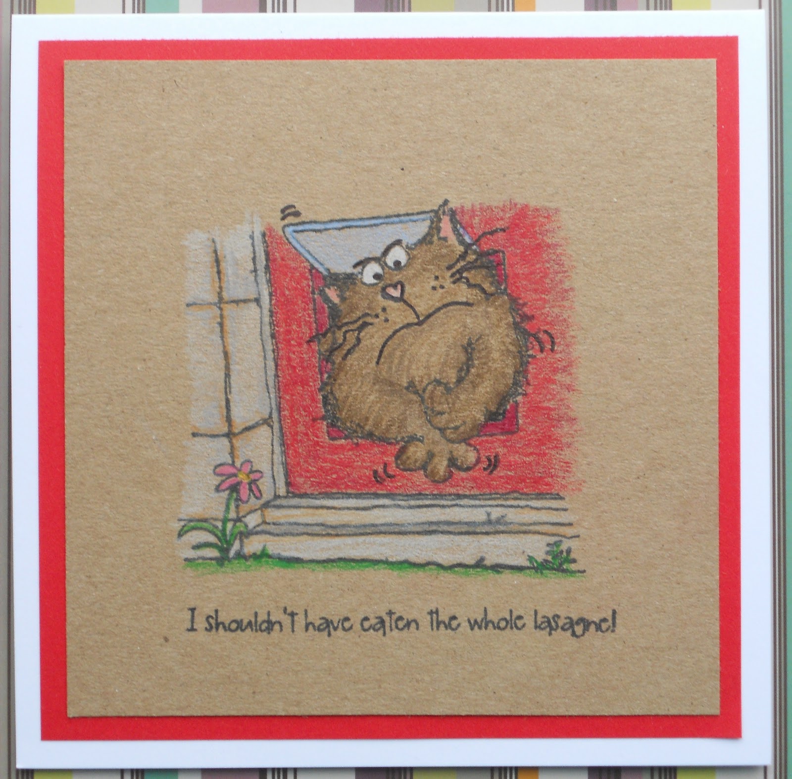
My second card is a Christmas one - Magnum from Ladybug Crafts stamped on kraft and coloured with pencils.  The cocktail here is an oldie but a goodie - a Snowball -  advocaat, lime and lemonade - I was always allowed a very weak one with my Nannan on New Years Eve and thought it was the height of sophistication - well you would when you were 8 or so wouldn't you ;-)

I think that's exhausted my cocktail stamp ideas and I have to go and make tea as we're out early tonight at the Sheffield Comedy Festival - I may even partake in a cocktail while I'm there!

Catch you later ;-)

LIM Cocktails

Good morning LIMettes - time for our favourite weekly challenge again - and I'm loving the cocktail theme this week!   It's an appropriate theme as Less is More applies to the art of cocktail making as well as card making - all the great cocktails are the simple ones.

The ladies shared a little game to find out what your cocktail personality is - this is mine:

You Are Made Of Silliness, Pizzazz, and Giddiness


3 parts Silliness
2 parts Pizzazz
1 part Giddiness

And a Splash of Happiness

Finish off with an olive
Blogthings: Our Quizzes Weren't Written By Bored 12 Year Olds


For my card, I have used my brand new stamps from Stamping Bella - her new range of  "Uptown Girls" which are just perfect images for me to make cards for all my girlfriends as we do love a cocktail!  Stamping Bella is a Canadian Company if you've not come across them before with a fabulous range of stamps (not just images for colouring) but I get mine in the UK from Quixotic Paperie and these stamps landed here just this week and I got mine yesterday so the timing of today's challenge is perfect!   

This one is called "Madison has a Margarita" but I decided she'd be having a cosmo so changed the colour of the cocktail appropriately.  She is coloured mostly with copics - I have a new range of colours as there was a really good offer on so I had a little splurge!  I did do a little shading on top with pencils and sansoder.  I added a pink spotted matt which is from a Bo Bunny scrap from my snippets drawer and I used the same to matt the sentiment which comes with the stamp (I know Chrissie already used the same sentiment, but this is destined to be a retirement card for a friend next week so it had to have this sentiment on it!)  The little pink flat back gems were a little freebie with my stamps - Elaine the owner always includes a little something as a thank you which I think is a lovely touch.

Right, time to see what cocktails everyone else has come up with.

Catch you later


Friday, 14 October 2011

CASual Witches

This week's challenge at CAS-ual Fridays is to make a Halloween card without using any orange.  Well, Halloween isn't such a big deal in the UK so I don't have any use for Halloween cards per say, but I do love witches - so I'm hoping my witch themed card still counts and I haven't missed this challenge since it started.


I've used this cute little digi image that was a great freebie from Michelle Perkett Studios and coloured her copics and cut her out and popped her up on dimensional pads but - it's not showing up on the photo - the problem with flash photography and nighttime blogging!    I printed the sentiment  and just cut it really close and finished with a couple of strips of paper to pull out the colours from the witches clothing.

Here's the link to the challenge if you want to play along - http://cas-ualfridays.blogspot.com/2011/10/cfc24.html

Thanks for visiting tonight - have a good weekend.

Craftilicious x

St Luke's Take 2 - News Flash!

It was one of my husband's friends birthdays yesterday and he asked me to make a card for him.  He's not an outdoorsy or sporty type, but loves films, tv and video games so I knew that my papersmooches set was the perfect choice.  This would be a perfect card to enter to our "Let's Hear it For the Boys" challenge over at St Luke's Charity Cards Challenge http://stlukescharitycardschallenge.blogspot.com/2011/10/lets-hear-it-for-boys.html we have a great prize up for grabs and you still have 2 weeks to join us with your masculine themed cards.


For this card I stuck to 3 colours - kraft, red-brown and black.  I like the simple retro effect.  The TV set was coloured with copics direct onto kraft and glossy accents provided the shiny screen.  I split the sentiment and image up for added interest as I like the strong black matt for masculine cards.

I am entering this into the anything goes challenge at http://onestopcraftchallenge.blogspot.com/2011/10/week-152-anything-goes.html

Thanks for stopping by  x


Wednesday, 12 October 2011

Not scary but cute witch

I've not managed to make much this week, by mojo has definitely gone on holiday of late - I guess it doesn't like the cold and damp weather....

There are a lot of Halloween challenges around at the moment though and I have a super cute little swiss pixie Brigitta witch stamp that has never seen ink so I was determined to play with her.  When I saw this weeks colours at ColourQ I knew how I wanted to colour her - the grey, black, tangerine tango and crushed curry they have are just perfect for her


Cooking it up with Katie gave me the inspiration for the layout - they wanted to see colouring - well my image is coloured with copics - and they also wanted to see circles and paper curling, so I cut a couple of circles in mustard and grey with nesties and distressed and curled the edges.  I used some papermania black, white and grey spotted paper and some orange striped paper to finish the layout - I do like to mix spots and stripes.

As well as the two challenges that inspired my card design, I am entering the following  Halloween themed challenges too:

http://cupcakecraftchallenges.blogspot.com/2011/10/cupcake-163-halloween.html

http://cutie-sunday.blogspot.com/2011/10/cutie-sunday-151-09102011.html

http://7kidschallengeblog.blogspot.com/2011/10/challenge-32-happy-halloween.html 

Thanks for visiting

:-D

Sunday, 9 October 2011

Smile


This week's CAS-ual Friday's challenge is a little different - there is a blog hop in aid of Julie Ranae who has had some terrible problems resulting in the loss of her two front teeth and is now faced with a HUGE dental bill to get her smile back.  As well as the usual challenge there is a blog hop with $2500 worth or prizes up for grabs and on every blog there is a donation button to donate a little to help Julie get here smile back - which I've done - just a few dollars but every dollar counts.  I am so glad to be in the UK with access to subsidised dental treatment - I think your smile is very important for your confidence and sense of well being.

They want us to make a card using the phrase above as inspiration and this is what I came up with:


I've used a 7 x 5 kraft card base with some blue paper and faux stitching.  I've then used some pieces from an old HOTP quick cards kit with the addition of a few buttons.  The U was actually on a brown square but I decided it looked better cut out.  That's it from me today I think as my mojo seems to have gone on holiday with the tidy up fairy.....

Check out the start of the blog hop here http://cas-ualfridays.blogspot.com/2011/10/cfc23-operation-julies-smile.html

Craftilicious x

Saturday, 8 October 2011

Transparent Clothing

I follow the super talented Zoe and her fabulous design team over at Make it Colourful and their tips and tricks REALLY help me improve my colouring skills.  They have started to set fornightly challenges, just colouring challenges, so you don't have to make a full card or project if you don't want.  This time round is a really difficult challenge - transparent clothing - I had NO IDEA where to start but after seeing the DT's attempts I've decided to give it a go.    There isn't a huge amount of transparency on my effort, but I tried a couple of more complicated images and they're in the bin - I think this technique needs the right image as much as the technique.

So I've opted for this great punk image from Tiddly Inks.  To get the transparent effect I drew the continuation of her legs under the skirt with a momento liner pen and then used very pale copic blues, with, thanks to the great tips from Carole of Brum, an overlay of white pencil in places.


Other than skin tones I stuck to just blue and black for this image and I really like the effect - she's called Pinky though so one day I really must colour her in pink!


One Layer Hearts

Well its Saturday again - hurrah - even if it is grim outside and I'm trapped in the house all weekend due to parking issues and local sporting events - I don't care as I can play all day in my craft room.

As its Saturday I've started with my favourite challenge of the week - Less Is More - which as it's the second Saturday of the month is one layer week and it must feature hearts.

I've made a couple of cards - first off a very simple teeny-tiny card with my Chemistry set from There She Goes as I just love it at the moment.  Stamped in black, and coloured the hearts with lady bug momento ink using a waterbrush and a couple of copics for the cork and bottle.


For my second card, I've used some of my new found inky techniques.  I have to say the online class I'm doing is one the of the most useful things I've ever done and its really helping me get over my inky phobia - now if someone can tell me how to get the damn stuff off my fingers (or better still how not to get it on there in the first place!) I'd be very happy!!!


For this card I masked off a strip with post-its, stamped a solid heart using pearl ink and pulled it away quickly to get a stippled effect and some texture - I embossed it with clear gloss ep.  I overlapped a text heart and embossed with ultrafine silver ep.  The hearts are from a set by Srappy Cat.  I added a white pearl sentiment from Verve and embossed that with clear gloss too.  I sponged deep mahogany and scattered straw ink over everything roughly with a make-up sponge - this is the trick I learnt - don't worry about how smooth you get the ink - simply over-spritz it when finished with water or pearlised water.  I used pearlised (made myself using blond moments powder in a tim holz mini spritz with water).  I wiped the ink off the embossed areas whilst the ink was wet then dried the whole thing with my heat gun and hey presto - smooth inky finish the easy way!

Time for some lunch and the off to see who else is playing today.

Wednesday, 5 October 2011

Continental Beer

This week's challenge at Daring Cardmakers was a really fun one so I've had to play along - they want your card to feature foreign languages - http://daringcardmakers.blogspot.com/2011/09/ooh-la-la-and-wunderbar.html


I've made a card for a friends birthday - and as you can guess - he's partial to a beer ;-)  I've used my Stampin up! Cheers set again on kraft and coloured with 3 shades of yellow copics.  I've paper-pieced the foam with plain white card.  To make my background - and this is where my foreign words come in - I've typed up "Cheers" in as many foreign languages as I could find on the internet (sorry if some don't read right in your language, you can never quite trust the internet!) and then aged it.  I crumpled the paper, uncrumpled it and then inked it with aged mahogany distress ink very roughly - now I've never been much good at distressing until I look the online techniques class by Jennifer McGuire - to get the effect I have here I used her tip - I didn't care how well I got the ink on, I just spritzed the hell out of it with water with some pearl powder in it and dried it with my heat gun - perfect inky agedness for the first time ever!  I finished with a strip of black card behind and a matching strip cut to the shape of a ribbon and white embossed with the cheers to you sentiment from the set and a tiny PTI Happy Birthday.

I am also entering this into One Stop Craft Challenge as it nicely fits there theme for this week which is "Just for Men"  http://onestopcraftchallenge.blogspot.com/2011/10/week-151-just-for-men.html   and it fits our theme at St Luke's too which is also Just for Men.


Big Cheese!

I just had to do a quick post this morning because I am thrilled - my Christmas Card from last week has been selected as this weeks' Big Cheese over at my favourite stamp store - Waltzingmouse Stamps


I am a very smiley person this morning because of it :-D

Back later with a new card

Tara x

Tuesday, 4 October 2011

Chemistry!

I got a new supply of stamps from There She Goes yesterday and immediately played with them for their current challenge which is a colour challenge - grey and yellow plus a neutral - which fit perfectly with one of the sets which just happened to be the one I wanted to play with first :-D

Sorry its not a great image - its a scan not a photo and its not showing the "white space" around the grey.  But I really loved this little image and sentiment "I love you beyond measure" 


I wanted to play with more of the stamps, so this one doesn't quite fit the challenge as there is no yellow, but I just couldn't resist making another little card - these are super tiny new card blanks from papermania - just 3 x 3 inch and make gorgeous mini cards or gift tags.  I just added a little embossed background detail to this one as its narrower than the other.  Expect to see many variations on a theme with this set!


These also fit the theme of "for the boys" at St Luke's this month.

To finish - I've just found out that one of my cards made the top 3 - I'm behind on my blog reader so only just found out today that I can add a new badge to my blog for this card - I love this range of cat stamps :-D


 Catch you later alligator ;-)


Saturday, 1 October 2011

The eyes have it!

 Good afternoon bloggers and happy world cardmaking day!


I haven't actually managed to do a lot of card making on world cardmaking day - it's unseasonally hot in the UK - 29 in Sheffield today so I've been out and about but I have managed to do a little craft shopping and make a card for today's LIM challenge.  This week its a colour challenge and we have to make a card the colour of our eyes and below is a very scary looking shot of one of my eyes which are mostly blue with a hint of grey and beige at their centre.


I've used the lovely sketch at Anabelle stamps as the deisgn to go with the blue of my eye and as I've been taking the great online techniques class by Jennifer McGuire, I've put into practice a couple of the new techniques I've learnt - faux suede and kiss resist embossing.


For the outer circles I stamped an elzybels flower with versamark and an elzybels text with grey distress ink and kissed the two together.  I stamped the flowers onto glossy paper and once dry applied broken china distress ink all over and buffed off to reveal the resist.  For the central one I embossed a square of glossy paper with a floral folder and sanded the raised elements with a sanding block carefully.  I inked it all over with broken china and the two different textures of cardstock absorb the ink differently giving you the faux suede look.  I finished with a matching floral ribbon and matching gems as per the sketch.

I'm only on lesson 3 of 12 of the techniques class but I have to say I have learnt so much already and it is totally worth the mere $19 price tag.  I hope to get a little time tomorrow to do lesson 4!

Don't forget too as its the first of the month we have a new challenge over at St Luke's Charity Cards Challenge - we want to see masculine cards and have this amazing prize from Craftie Charlie up for grabs for the best card this month.


Catch you later.......

Tara (aka Craftilicious) x

Let's hear it for the boys!

This month over at St Luke's Hospice Charity Card Challenge we are all about the boys - you can make any card for any guy of any age for any occasion as long at it's masculine it counts.  I know we sometimes struggle with male cards but hopefully we'll give you lots of inspiration throughout the month and hope to see a record number of entrants.  We've got an AMAZING prize this month from the lovely ladies at Craftie Charlie and here it is:


It contains all these brilliant goodies which can be yours if you enter the challenge and are the DT's favourite for the month:
  • My Mind's Eye Limited Edition 6x6 Double Sided Paper Pad - Dwell
  • East of India Pale Pink Ric Rac
  • Inkadinkado Mini Stamp - Thanks
  • Tsukineko Memento Dew Drop - New Sprout
  • Ranger Liquid Pearls - White Opal
  • K&Co Glitter Chipboard Alphabet - Smitten
  • K&Co Amy Butler Lotus Embellishment Jars
  • Creative Expressions Decorative Pins - Cream Pearl
So, I'd better get on with my card - I've gone for a get well card, for an older guy and used this great oldish image from High Hopes.  I've coloured him with copics, cut him out and mounted him on some green paper embossed with a circles folder - this gave me the idea of "golfing greens" so I've put the ball in one of the "holes" and made a flag with some ribbon and a cocktail stick and a peel off sticker 18.


 As well as being my DT entry for St Luke's I am also entering the following challenges:


One for the boys -  http://oldiebutagoodiechallenge.blogspot.com/2011/09/challenge-27.html

Use a stamp older than 6 months -   http://simplycreatechallenges.blogspot.com/2011/09/53-challenge-older-than-6-mos.html

Ribbon loops -  http://cas-ualfridays.blogspot.com/2011/09/cfc22.html

Sports -  http://cardsformen.blogspot.com/2011/09/challenge-20-sports.html

Don't forget that our challenge is a little different - we don't just play for fun and prizes, we play for charity - we ask our players to post their challenge entry (if they can) to the Hospice and we then sell them at craft fairs and markets to raise vital funds to help keep the hospice open - we've had over 800 cards donated to date.  Check out the challenge site for more details http://stlukescharitycardschallenge.blogspot.com/

Thanks for stopping by ;-)

Craftilicious x

Friday, 30 September 2011

Birthday Witches...

I don't make Halloween cards as such, but I do like witches and I love this Kraftin Kimmie stamp but have never inked it before tonight.  I started with the KK sketch this week as illustrated here


I tweaked it a little to fit my card shape and only had room for 1 embelishment not 3 but I think it still resembles the sketch.  The witch is coloured with copics  in suitably spooky shades and cut out leaving a slight border.


I printed a spiders web and spider and cut with a circle nestie and continued the circle theme onto the purple paper with an embossing folder and with some dotty DP.  The sentiment is computer generated and the flower is a rolled die cut.

I am entering the following challenges with this card:

http://movingalongwiththetimes.blogspot.com/2011/09/challenge-118-spooky-goings-on.html

 http://crazy4challenges.blogspot.com/2011/09/crazy-4-challenges-c4c106.html 

http://kraftinkimmiestamps.blogspot.com/2011/09/challenge-97-pams-sketch.html

Catch you later
x

Tuesday, 27 September 2011

Autumn Leaves

I'm not normally a Tim Holtz girl - I've got his book and distress inks but I've not been very successful with his grungy style - it leaves you with messy fingers for one thing (I would photograph my hands but its too embarrassing I look like a 2 year old let loose in a paint factory!!!)  However, I saw this die yesterday and I just HAD to have it and it arrived, thanks to Craftie Charlie,  within 24 hours so I've been playing nice tonight.


I've followed the sketch again from this week's Less is More challenge as I think the placement works with the two simple elements.  The colours are from this weeks Play Date Cafe which are Green, Rust and Gold.  I am also entering into Digi Doodle Shop Challenge which is autumn colours.

I cut the shapes on the die (it's a thin strip die so you need a 12" extender plate unless you have a calibre) using the rust, gold and green textured card and I inked the edges with distress ink and a make-up sponge (hence the messy fingers!) and stuck them on with a glue pen.  I did add one neutral colour - dark brown for the branches and acorn.  The sentiment is from inkadinkadoo inked with a gold chalk ink and then I dabbed rusty hinge on top with the make-up sponge to add the feeling of the leaves turning into their autumn splendour.

Right - off for a bath now to scrub the inky mess off!
x

Monday, 26 September 2011

OLW Sentimental

Another quickie - on a bit of a roll tonight so sorry to overload your blog reader!

I haven't played along with OLW since it returned from its summer break, but I love sentiment stamps and fancied the challenge of doing them one layer rather than my usual approach of putting them in nesties with lots of ribbon and DP.  This is what I came up with - I'm in Christmas mode still as you can see:


Stamps are Waltzingmouse - inked simply in black and silver with a tiny spot of glitter in the centre of each snowflake.

That's all for tonight folks.

Tara x

Girly Cheers!

We did the boys version yesterday, but today is one of my girl friend's birthdays, and she likes a good cocktail, so I thought the cheers to you set was the perfect choice for her card too.


I stamped the 3 cocktail glasses, coloured with copics and finished with a layer of glossy accents to make them shimmer.  I used some gorgeous DP from My Minds Eye Fine and Dandy stack and matted the glasses and sentiment onto a tonal card to match the papers.

Quick and simple  but festive and effective - I think this set would make great party invites too.

Catch you later
x

Masculine Cheers!

I've had a couple of card commissions this week, one for a granddaughter which I'll share later and one for a nephew and this is it.


I've used the cheers to you set from Stampin Up!  I stamped a row of beer glasses onto kraft and coloured with a couple of shades of yellow copics and paper-pieced the white foam with plain white card.  Matted onto black and then onto some DP from My Minds Eye I think.  I cut the cheers sentiment with a round nestie and drew around the outside of the die to get the slightly larger black circle (the next size nestie was too large).  The happy birthday nephew is from my very useful Elzybels words set.

I am entering it into Annabelle stamps "make it masculine" challenge and the Allsorts challenge this week which is Clean and Simple.  Plus as all the papers on here are from my snippets drawer - then I am playing along with Jules this week too sunday snippet challenge

Craftilicious x

Sunday, 25 September 2011

It wouldn't wash at Wimbledon...

I've had a couple of these lovely new Magnolia stamps from their sporty release for a while but this is the first time I've managed to ink one up.  I'm combing a few challenges with this image - I started with Copic Oz's getting sporty challenge - hence the image choice.


For the colour choices I took my inspiration from the pink elephant's photo inspiration challenge, which were pinks and greens which is the same challenge over at cupcake craftroom so I am entering their challenge too.  Finally, there is a new challenge and they just want you to feature people so this counts for the Touch Twin Markers Challenge also, and until next year you can use any markers to colour your image (I think I may need to try these too - I do have such a weakness for pens - a little like Pauline from The League of Gentlemen.......)

So back to my card, the image as I said is Magnolia, stamped in momento ink, coloured with copics and as much as I like it, not sure she'd be allowed on court at Wimbledon in this little pink and green number!  I cut her out with a nestie, using the cut out technique for the racquet.  I cut the ball out by hand.  I used a couple of old K&Company DP sheets as they matched the copic colours very well (an no I didn't pick the papers first - this was a pure fluke!) and added a little webbed ribbon as it sort of reminded me of a tennis net.  I made the sentiment up from my "words" and alphabet sets from Elzybels.

Thanks for stopping by
Craftilicious x

Saturday, 24 September 2011

CASual Colours

Back again, this time with my entry for CASual Friday - which is a colour challenge - 3 shades of one colour plus brown and here's my take on it.


It's definately a Waltzingmouse stamps day as my card features only their stamps again.  I've started with a blue top fold base card and I've added my brown in the form of a script embossed chocolate brown strip which overhangs the card.  I've then stamped a WM doily onto white card with aqua ink (shows up better irl than on the photo I'm afraid) and I cut it out, on top of that I stamped a smaller doily from the same set onto aqua card and embossed it with sapphire ep.  I cut that out too and mounted onto the other with foam pads and finished with an aqua pearl centre.  I've then used a WM sentiment "thinkin' about ya" under the brown to finish if off in sapphire but without the ep just the ink so again it isn't show up on the photo as well as it does irl (very poor lighting here today so flash was necessary)

I love the addition of the brown to the blue - not something I'd considered before but from the looks of the other entrants and DT samples - brown could very well be the new black ;-)

Thanks for stopping by - be sure to let me know you've dropped by so I can return the visit
x

Blogging tips